About Pacifico Energy
Pacifico is one of the largest independent renewable developers in Asia, with a proven track record and a large pipeline of projects.
Bringing a renewable power plant online is an incredibly complex process, from conceptual planning to financing, construction, operations, and maintenance. By handling every aspect of the process, we can ensure that all components work together seamlessly to deliver best-in-class results while staying within budget.
Industry of Hues™ was approached to create supportive branding based on the central identity created alongside renowned designer/author David Airey. The first major task was a series of international brochures. This was followed by a framework for the global web presence.
Check that out > here.
Back to the brochure:
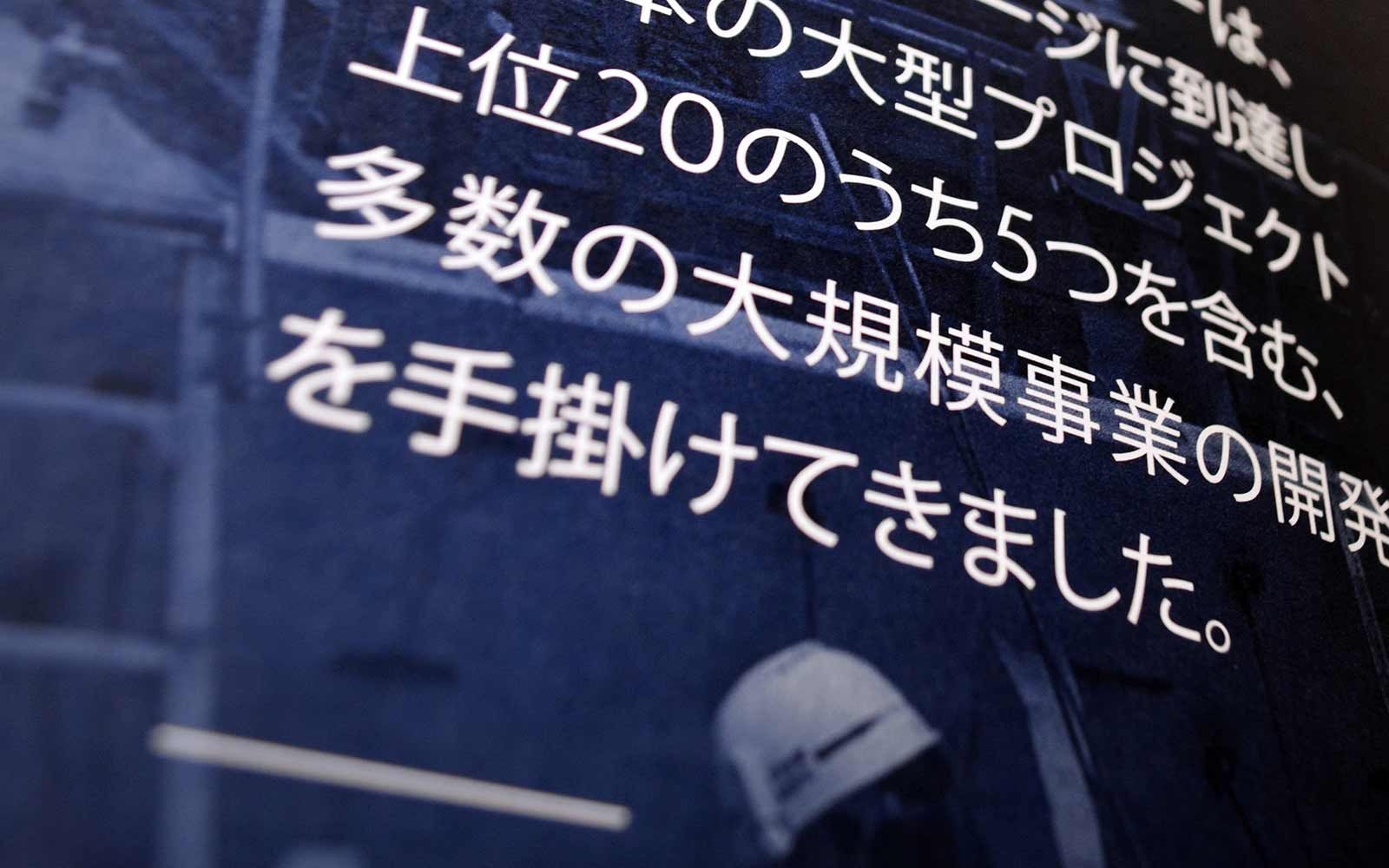
1. Not one, not two, but four translations needed
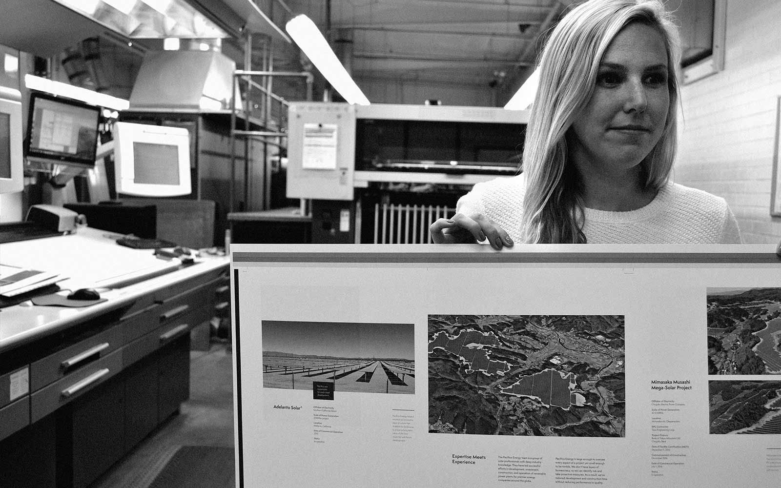
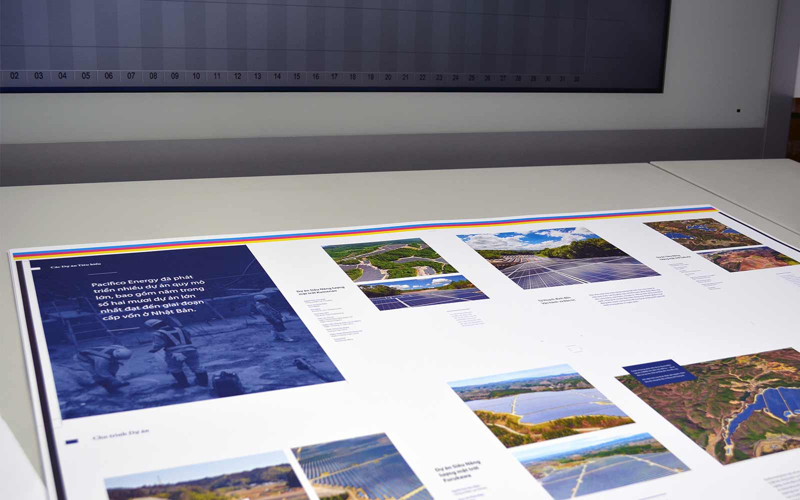
We had one design, but the series required translated versions for Japanese, Vietnamese, and Korean content as well. Luckily, we teamed up with the right partner as our printer. Neyenesch not only handled the translations with their own direct connections, but they also managed the layout. Implementation of the translations was also handled as part of the overall production. Can you say “incredible” in multiple languages?!?
2. Paper choices to support Mother Earth and the client
Neyenesch helped to guide us in choosing paper companies and product that support sustainability and timber regulations. This falls in line with being good humans in general, as well as being on-brand for our alternative energy client.
3. PMS color, POP the client’s key brand color
Brand color was tricky to maintain with a straight-up 4 four-color process, so we decided on 4+1, using a PMS for the larger duotone image treatments and the color-blocked areas. This allowed for a rich brand blue, as opposed to a mixed 4 four-color version that screened back to an almost a purple hue.
4. Production techniques that hit the mark
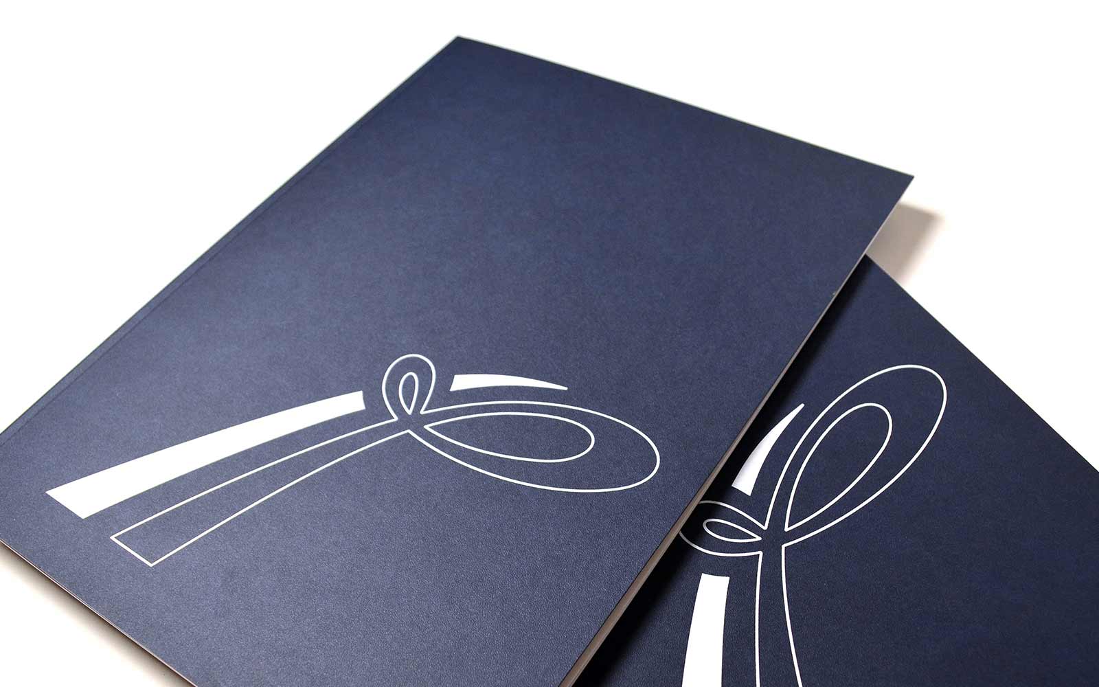
We did embellish a tad here, die-cutting on version one and using a foil stamp on version two.
For the foil version, we increased pressure to the max and had a decent effect paired with the stippled, navy exterior cover. An alternative suggestion was to use a matte silver foil, in place of the white. That combo would also have been a success—, a bit more sheen, but not too much flare.
During the second round of printing, we made a few upgrades based on what we had learned during the initial run. In addition to an extra two signatures’ worth of updated projects, add-ons included:
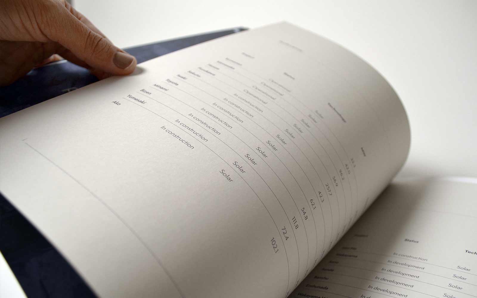
- Perfect binding for a more elevated and refined edge (upgraded from black staples, which were already an upgrade from silver staples)
- Center tip-in for “At a glance” project review (also allows for more efficient reprints when new projects are added)
- White foil on the cover
…
As always, Industry of Hues™ embraces collaboration and the full scope of process. Neyenesch’s expertise, coupled with our client’s trust, plus a desired level of polish from all involved, led to a lovely final product.
…
Industry Collaborators:

